You are reading a post from a multi-part series of articles
- Staying on the bleeding edge
- Home pages that morph
Have you ever struggled to create a beautiful landing page for your Django site?
A common ask by users of the Edge project template was the support for home pages that had a completely different layout than the inner pages. For example, a first time visitor opening https://example.com should see a landing page that shows the benefits of signing up. But once signed-in the same url https://example.com should show the user interface of the web application.
This is a common pattern today. For example this is how different github.com looks to a first time visitor and a logged in user:

What’s a Landing Page
A landing page is a standalone page created for a specific marketing conversion goal, like subscribing to a newsletter or ebook downloads. For the purpose of this article, we will focus on the conversion goal of signing up users to your website or online product.
A good landing page must be convincing enough for a visitor to share their personal details like their name and email. Even then, ask as few details as possible in the sign up form. If it is not relevant like the Company field, it is best to remove it. Expedia dropped the “Company” field from their booking form and saw an increase of $12 million a year in profit.
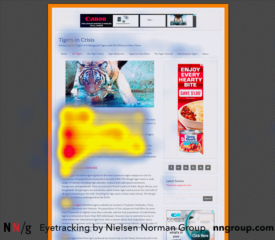
It must also be optimized for quick scanning. A widely quoted but often misunderstood study by Nielsen Norman Group showed how reading on the web is F-shaped. This is often bad for users and businesses since it skips important content. The recommended solution is to include important content in the first two paragraphs and have headings with the first two words bearing the most content.

A homepage can be distinct from a landing page. But for many visitors who come to know about your site say through a link shared on a social network or an ad, the home page is the gateway to your product. So many sites check if the user has not logged in and show a landing page instead.
Challenges in Django
The challenge for most Django sites is that this requires extensive changes to the base template. A base template defines the basic structure of the site. Django documentation explains it further - a base “skeleton” template contains all the common elements of your site and defines blocks that child templates can override.
The landing page differs considerably in content and layout from the inner pages. Here are some of the main differences:
- Objectives: The primary purpose of the landing page is to typically get users to sign up. The entire page is focussed on convincing the reader to perform the Call to Action (CTA) of clicking the “Sign up” button. Once you have signed up, your objective changes to give a good user experience while using the product i.e. the web application.
- Layout: Landing pages typically have a simplified and vertical layout where you are scrolling down to view engaging visuals and exciting animations. However a logged in user typically needs a more functional interface where various interface elements like sidebars are always within reach.
- Navigation: Most modern landing pages remove the top menu entirely along with other links to internal and external pages to simplify the experience. It does not make sense to show the application menu or the user profile drop down to a visitor who has not yet signed up.
- Assets: Landing pages, like other marketing pages, have scripts and other assets that track the effectiveness of pages like click through rates and conversion metrics. The inner pages would have different assets needed to create and maintain an effective user interface.
- Optimizations: According to a study of the top 1000 websites, landing pages are 35% heavier but load faster by 56% than internal pages. This could be because the landing page needs to give a much more optimized user experience as it forms the crucial “first impression”.
In theory, a Django application could be crafted with a base template that can accommodate both a landing page and a web application layout. In practice it will be extremely cumbersome. As you have seen these two kinds of pages often have nothing in common. They might even be designed by two different teams. So, given a single base template you will often end up in overriding most of the blocks. There has to be a better way .
It’s morphin' time!
Before we go further, it will be useful to give a name to this common pattern. Despite a lot of research, I couldn’t find any existing literature that names this pattern. So I went ahead and called it a Dimorphic Home Page pattern. The word Dimorphic means a thing that exists in two different forms. In this case a home page that changes form depending on whether the user has been authenticated or not.

Here is a simple view (taken from Edge source ) that implements this solution:
from django.views.generic.base import TemplateView


class HomePageView(TemplateView):
	user_template_name = "users/home.html"
	anon_template_name = "anons/home.html"

	def get_template_names(self):
    	if self.request.user.is_authenticated:
        	return self.user_template_name
    	else:
        	return self.anon_template_name
We have used Class Based Generic Views instead of Function Based Views because they are easy to extend. For instance, if you need to pass a signup form in the context variable (and remove another page reload from conversion) then another view class can be derived easily.
In terms of organization, the templates for unauthenticated and authenticated users are kept in separate directories named say anon and users respectively. This makes it easier to prevent unintentional leakage of sensitive data in unauthenticated pages.
Designing a Beautiful Landing Page
The landing page of Edge has been designed based on modern landing page best practices. If you study several actual landing pages, you would observe many of them use common animation components like animate.css and wow.js. This is what powers the sliding and dancing images or text as you scroll down revealing new sections.
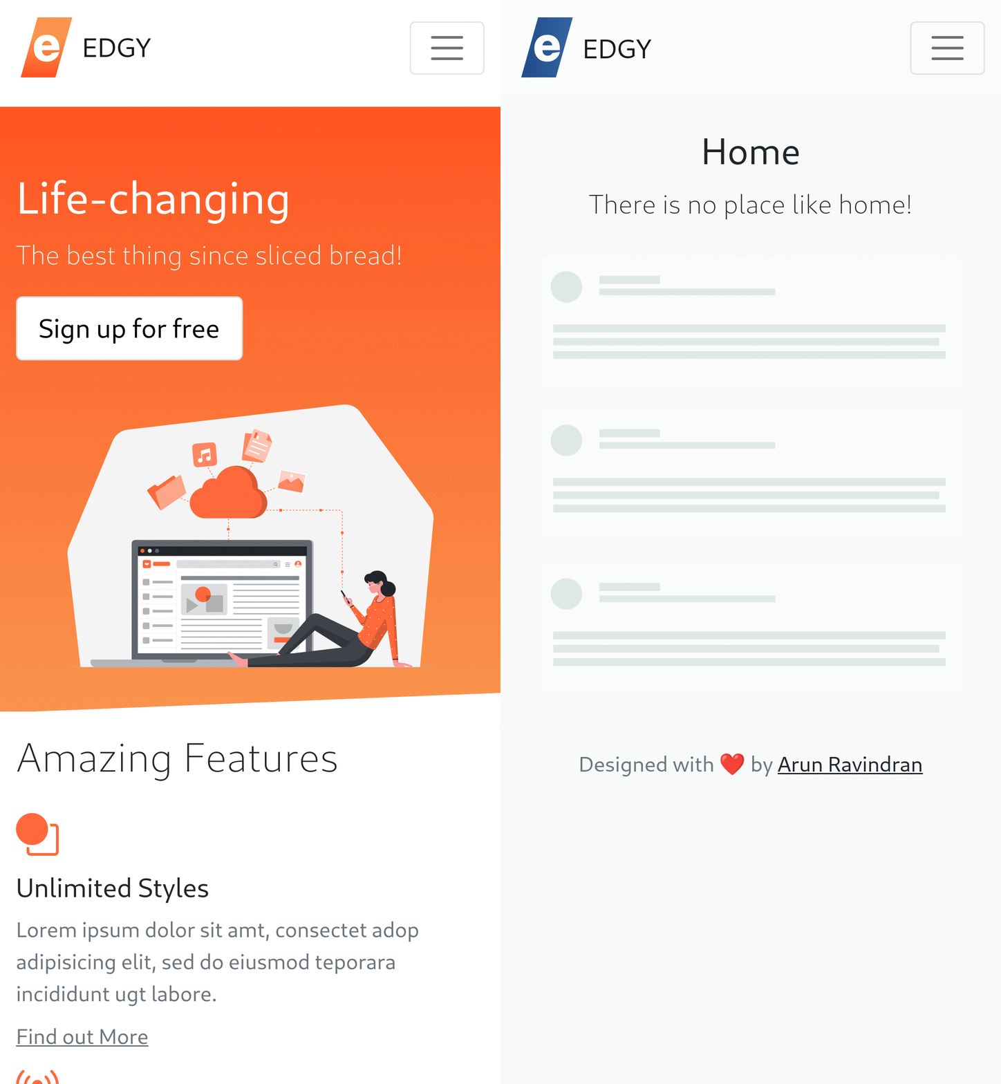
The dimorphic Edge homepage is a work in progress but it currently looks like this:

Design sensibilities change over time. But the template should be a good starting point for solo Django developers who are not familiar with design. It would be less daunting than starting from a blank HTML document.
Try what is new
Check out the Edge Django 3.x branch with its dimorphic landing page. Follow the instructions in the README to create a quick Django project. We welcome your feedback and contributions.


